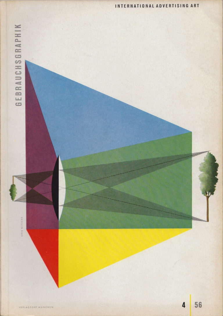
Erik Nitsche was a Swiss-born graphic designer who’s innovative and visionary work in the 1950s as art director for General Dynamics is some of the most exciting of the era,
graphically distilling complex scientific principles down to interactions of minimal geometric shapes presented in clear, colourful and visually striking compositions that still got the concepts across to the audience.
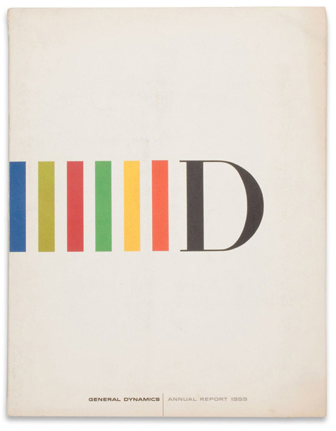
His printed work was immaculate, combining clean type and contrasting different elements on a page into bold compositions which utilised a clean use of space, strong colours and geometry which epitomised the modernist aesthetic.
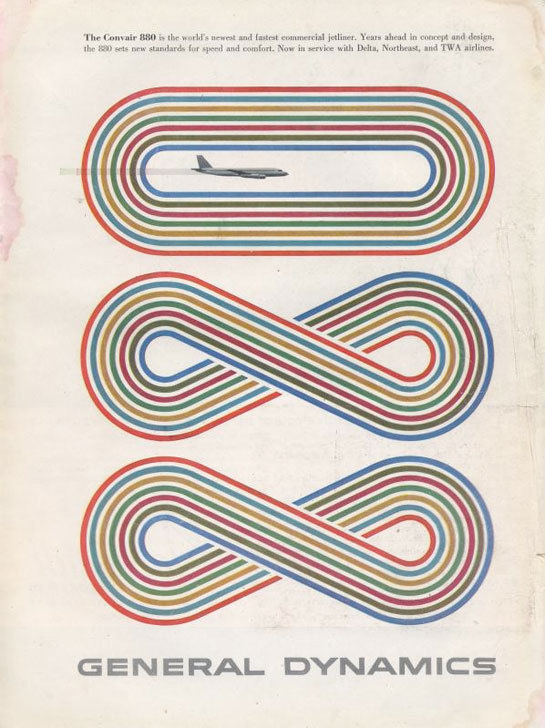
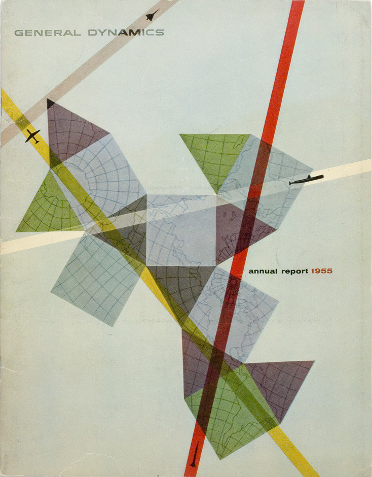
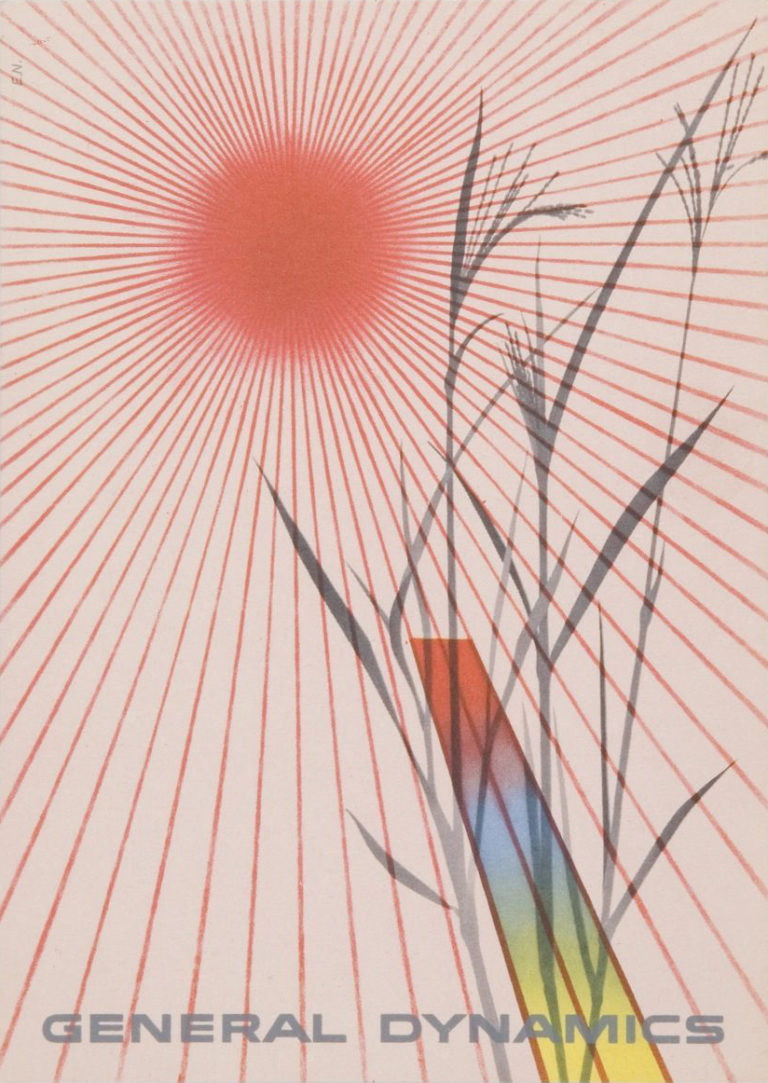
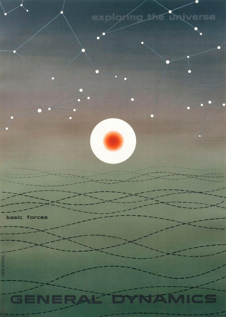
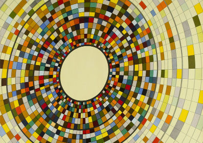
Printed work for General Dynamics, designed by Erik Nitsche, 1950
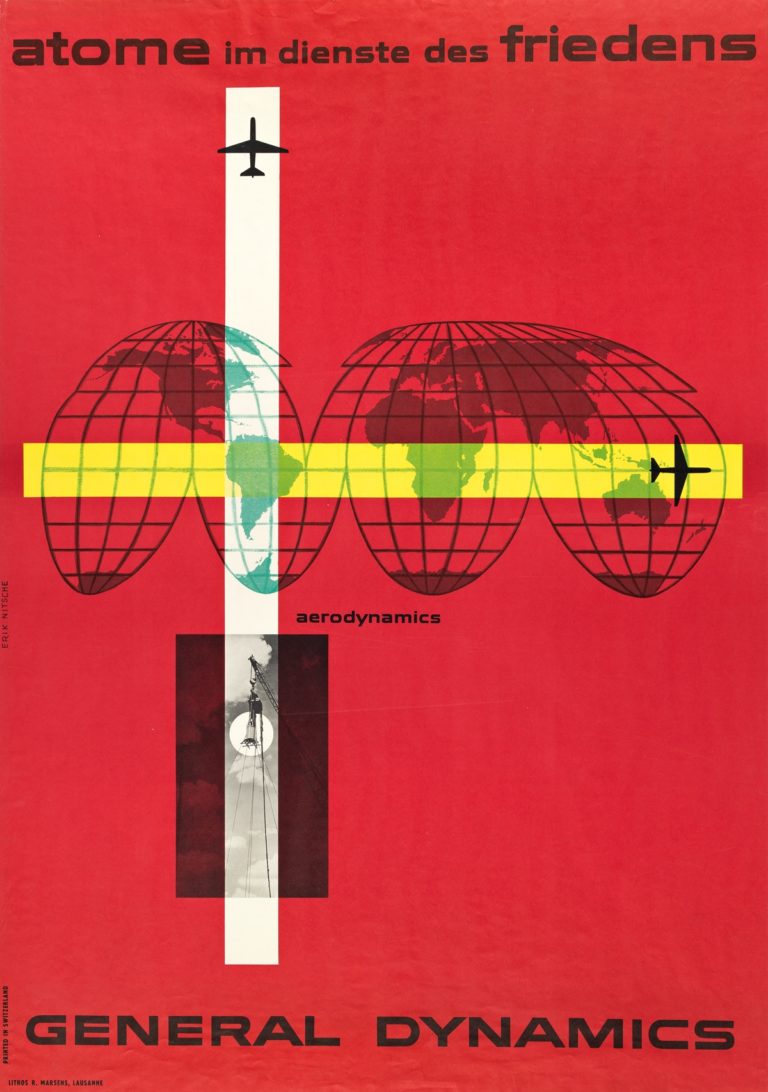
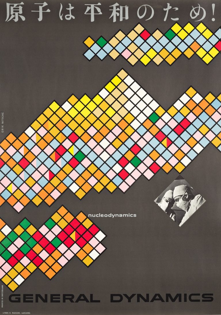
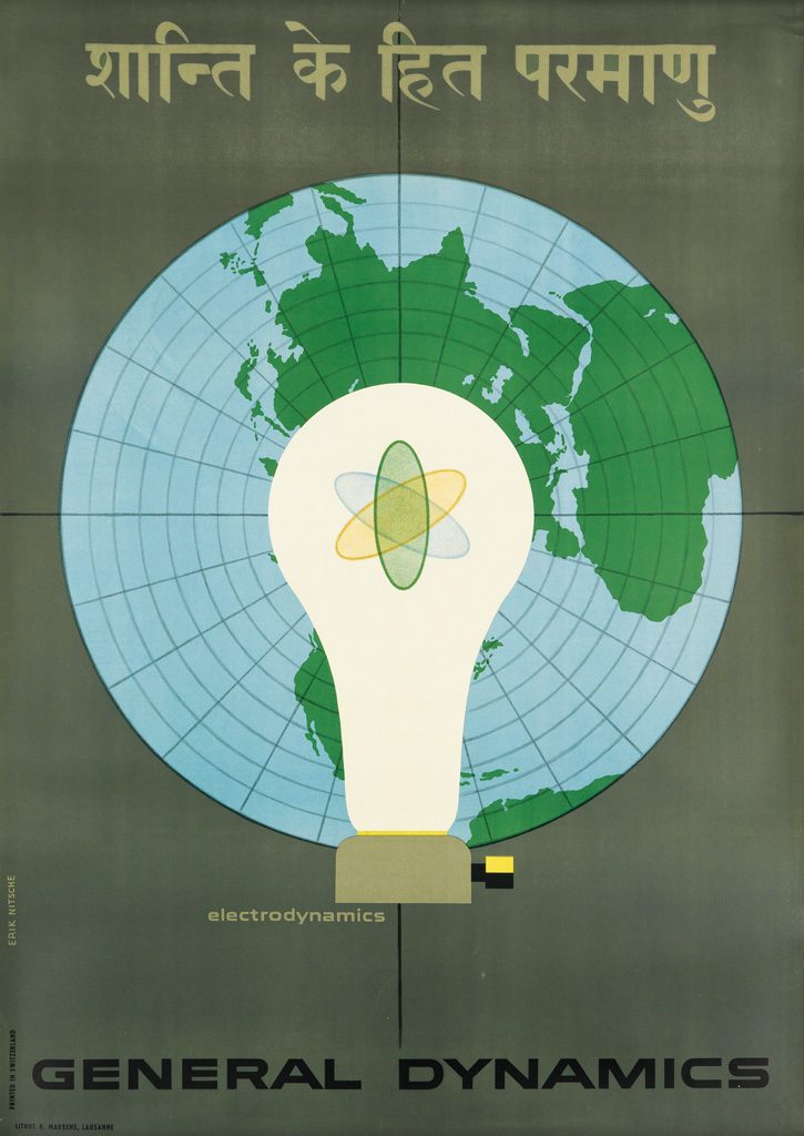
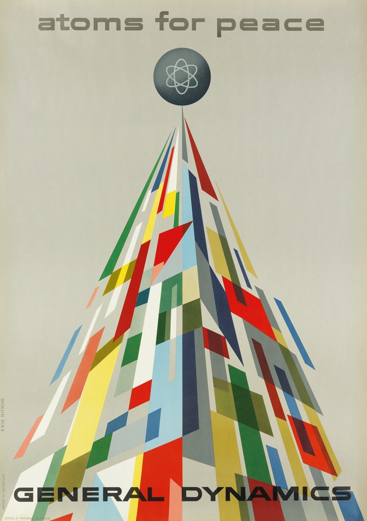
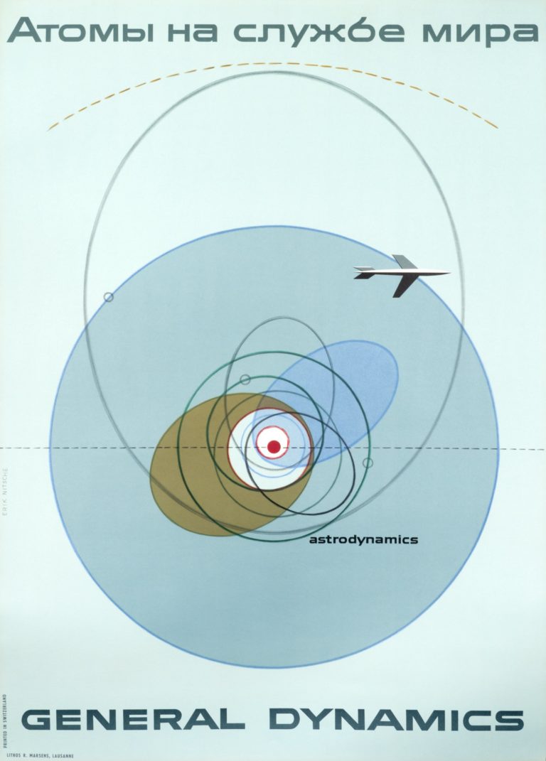
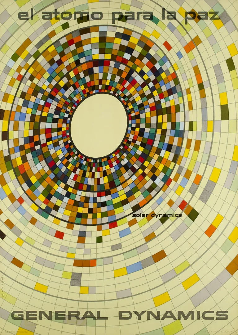
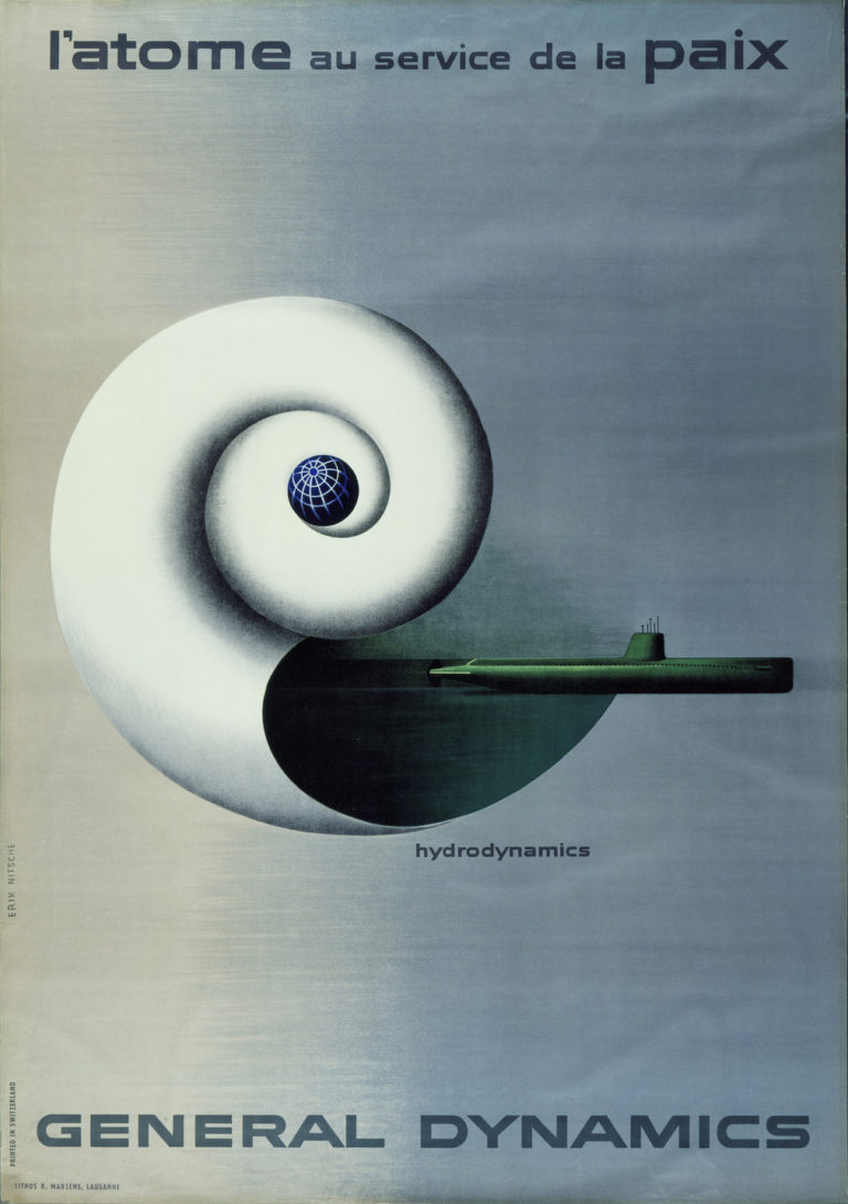
Some of Nitsche’s best known works for General Dynamics were the visuals for the multilingual ‘Atoms for Peace’ campaign. Tasked with selling the age of nuclear fusion to a sceptical public who had seen the bombs drop just a decade earlier, these graphics instead present an optimistic vision of peace and futuristic progression that could be brought about by harnessing the atom.
Each poster presented the ‘Atoms For Peace’ slogan in a different language, graphically linking particular values, cultural touchstones and issues of those countries to a proposed nuclear solution (hydrodynamics, nuclear fusion, solar dynamics etc). real brand-value.
Atoms for Peace’ poster campaign for General Dynamics, designed by Erik Nitsche, 1950s
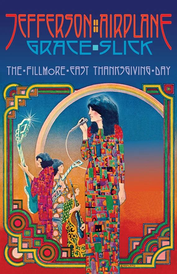
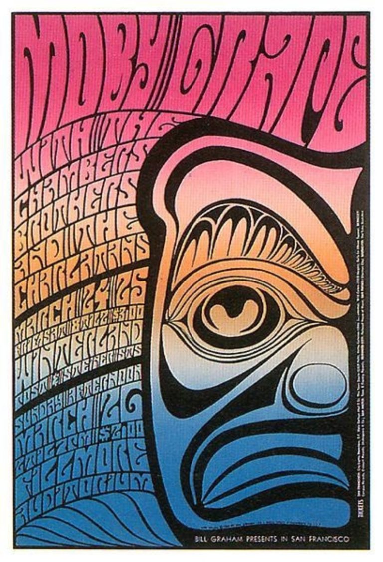
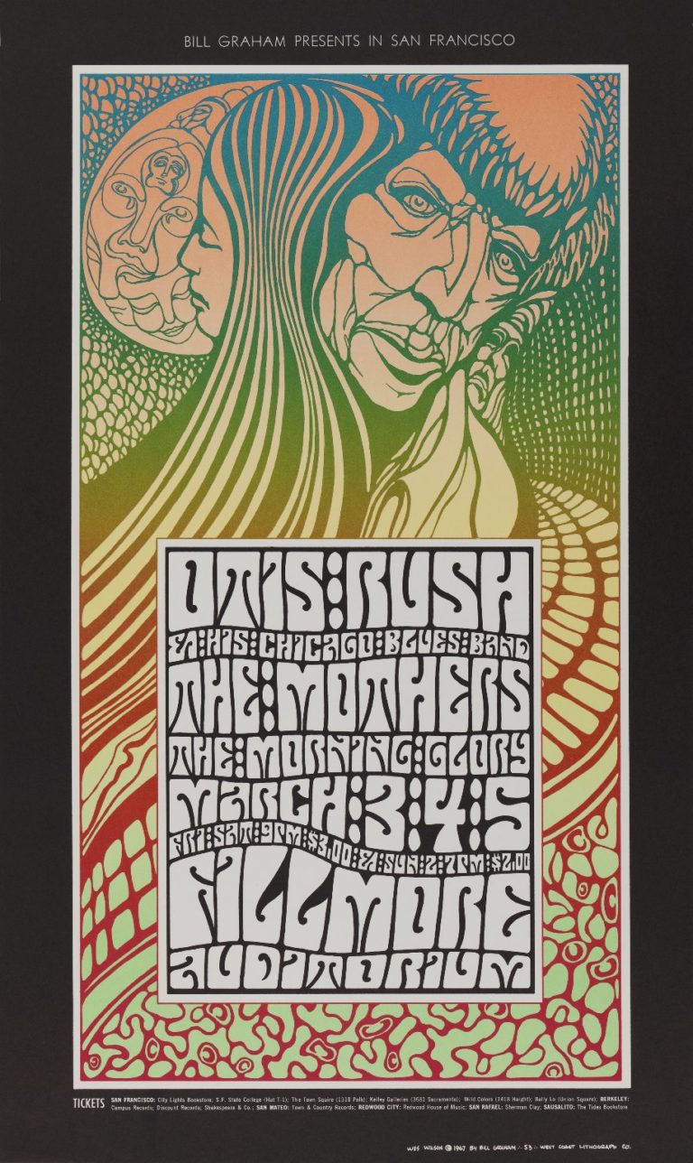
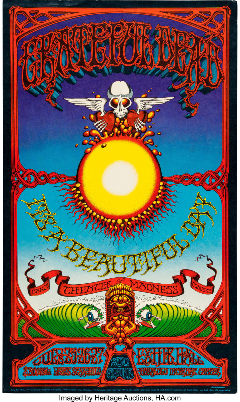
As well as revolutionising corporate visual language and advancing modernist design principles, Nitsche’s designs also pioneered the use of techniques like split fountain screen printing, using blending of colours in the ink pan to create gradients, a process which was adopted and popularised more than a decade later by the psychedelic poster designers of the 60s music scene for shows at venues like The Filmore in San Francisco.
1-3: Examples of split fountain printing for general dynamics, designed by Erik Nitsche, 1950s. 4-7: Examples of split fountain printing for events at The Filmore designed by various artists, 1970s.
Nitsche’s visual communication work is extraordinary in showing how a singular graphic vision can be used in issue-based design to advance a particular message and shape the direction of public discourse around topics as divisive as nuclear technology and the defence industry.
As specialists in issue-based design ACW take on principles of simple and clear presentation of complex ideas, and similarly seek to present important messages in a powerful way.
Author: @JamesUsill, designer at ACW To find out how we can bring your important messages to life get in touch below
Reach out today to find out what
we can add to your project